Exploring How To Create Effective Scatter Chart Designs
Charts are an influential tool for demonstrating complex concepts and data. They translate multidimensional digital data into clear, tangible visuals increasing our comprehension. Among them, one such versatile chart is the scatter chart. This article delves into its intricacies and how you can enhance its effectiveness to showcase your data better. Keep reading.
Table of Contents
Unveiling the Concept of Scatter Charts
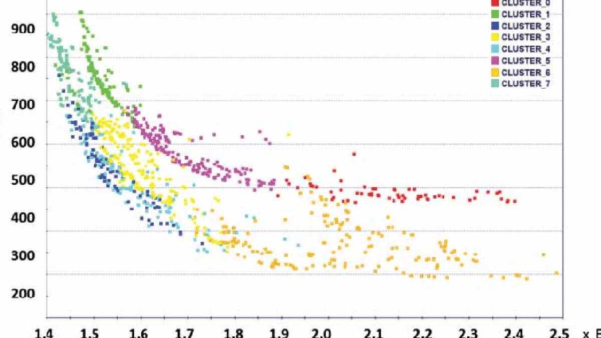
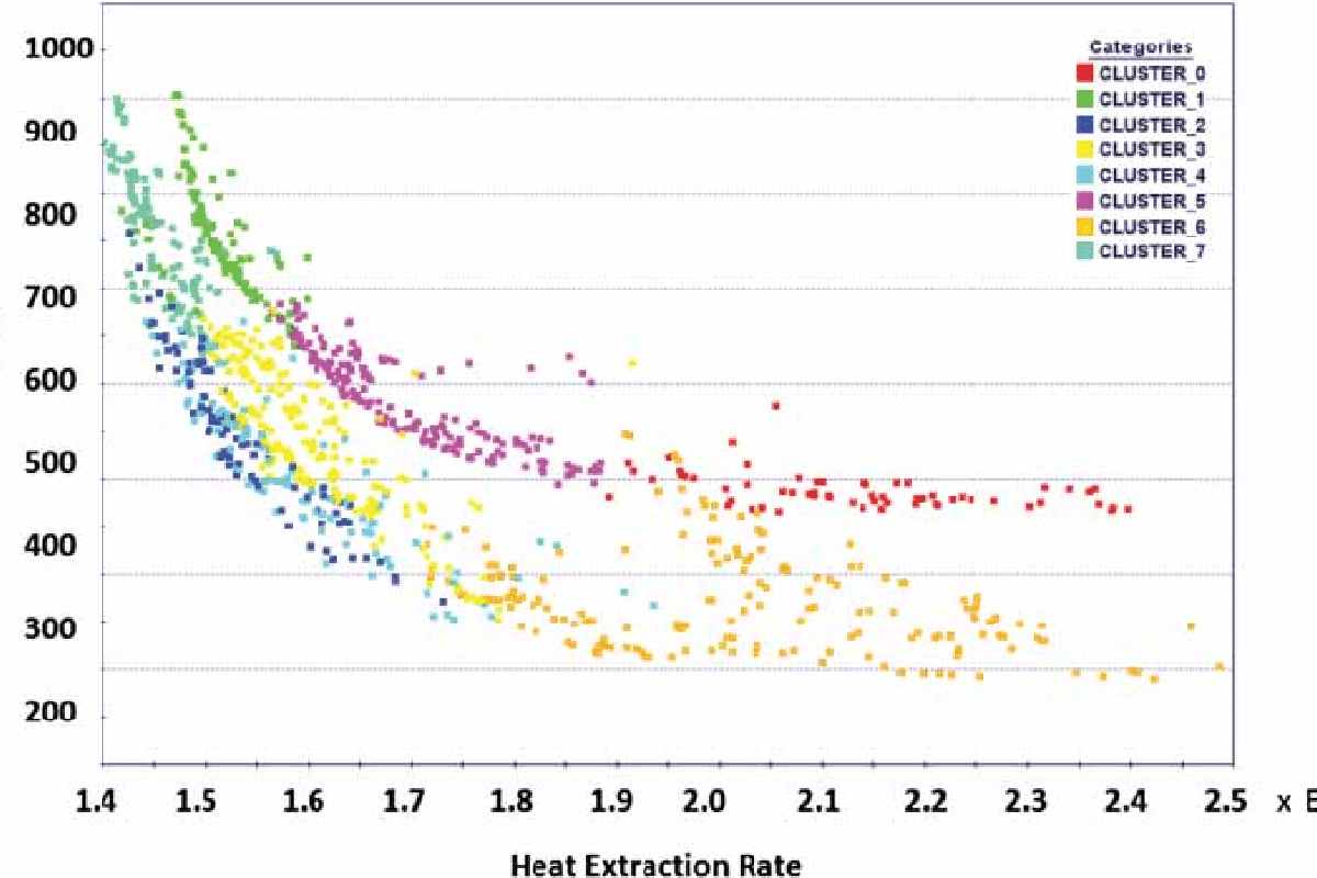
Primarily used in statistics and data analysis, a scatter chart or scatter plot is a type of plot that is used to display values for typically two variables for a set of data. It makes use of Cartesian coordinates to represent two distinct data sets. The data is expressed as a collection of points and each point represents a value.
These charts tend to reveal trends and correlations between the data sets that may not be apparent when viewed independently. A positive correlation appears as an ascending trend, while a negative correlation manifests as a descending trend.
Scatter charts are effective in drawing attention to patterns, relationships, and even anomalies within the data. They’re highly valuable in numerous fields including business, science, and economics.
Beyond these basic structures, scatter charts can be enhanced with extra features to highlight various information in the data or to cater to specific demands of data analysis.
Elements Contributing To an Effective Scatter Chart Design

An effective scatter chart is not necessarily complicated. A minimalist yet clear design can have a powerful impact. The chart should emphasize readability, interpretation, and engagement. Start with a compelling and concise title, followed by axes adequately labeled to reflect the data they represent.
One fundamental consideration in scatter chart building is the choice of color, scale, and symbols. Always choose colors that are contrasting and visually pleasing. More substantial markers might underscore essential data points.
The scale is another aspect that demands meticulous attention. Avoid using too broad or too narrow scales. This could either overwhelm the observer or fail to provide enough information. Consequently, it jeopardizes the purpose of data visualization.
To elevate the clarity and interpretation of your chart, you can incorporate a correlation line. A correlation line helps visualize the correlation trend among the data points better.
Steps To Create a Meaningful Scatter Chart
Creating a meaningful scatter chart entails understanding your data and your audience. The chart should be designed around these premises. The first step would be identifying the variables and ensuring that the data is well-fitted to be analyzed using a scatter chart.
Not all data is meant for scatter plots. So, scrutinize whether your data represents distinct quantities. If yes, the scatter chart would be a powerful tool for analysis. Then, prepare your data, ensuring it’s clean, complete, and accurate.
Once you have your data readied, draw your plot. Remember, clarity should be the priority. The scatter plots can be drawn by hand or software. Software offers cleaner and more precise plots along with additional features.
After drawing, evaluate it from the viewer’s perspective. It should not just visually appease but must assert the data story in the most clear and comprehensible manner.
Tips To Enhance Scatter Chart Visualization
Although designing a scatter chart might seem straightforward, optimizing it for maximum effectiveness could be an art. One way to enhance your visualization could be by exploiting color, symbol size, and transparency to differentiate between different aspects of data.
Always choose a dimension that’s easy for the eye to follow. Horizontal or vertical patterns are generally easier to decipher. Also, annotation is a powerful tool to direct the viewer’s attention to specific points or trends in your graph.
Maximizing the data-ink ratio could be another strategy. It denotes the proportion of ink used to represent the data, minimizing the non-data ink. Fewer distractions elevate the saliency of your data.
Altogether, effectively creating meaningful scatter charts is a blend of science and art. It demands an understanding of its form and function, necessitates familiarity with your data and audience, and calls for creative zeal to narrate your data story intriguingly. Exploring How To Create Effective Scatter Chart Designs